With a distinctive style and a project for The Telegraph already under his belt, talented editorial designer Jasper van den Bosch is destined for big things.
What has been the most important experience of your career so far?
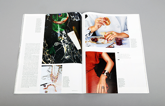
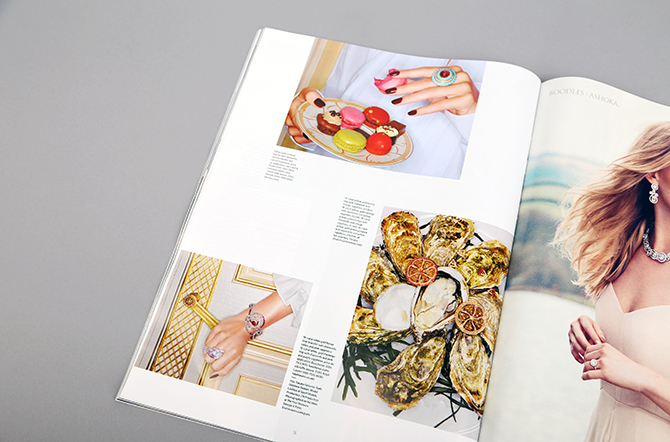
Probably my first real job since graduating – working on the launch issue of Luxury magazine for The Telegraph. I found that I was the only designer available on the day that it went to print, so with some work to be done before it was out of the door, I was in at the deep-end.
Tell us about Luxury magazine’s look?
The layout was representative of the content. It’s a luxury magazine covering a range of topics from fashion to motoring, so it needed a clean, contemporary feel. It was art directed by Sam Walton, who steers most of the magazine's imagery, and the typefaces are bespoke to The Telegraph so you wont find them anywhere else. I’ve just started working on issue two.
Who are your design heroes/heroines?
I'm not one for hero worship but in terms of contemporary designers I certainly admire Jop Van Bennekom. From the past, it has to be Alexey Brodovitch. He revolutionised the way we look at design editorials.
Talk us through your work for menswear brand Volklore.
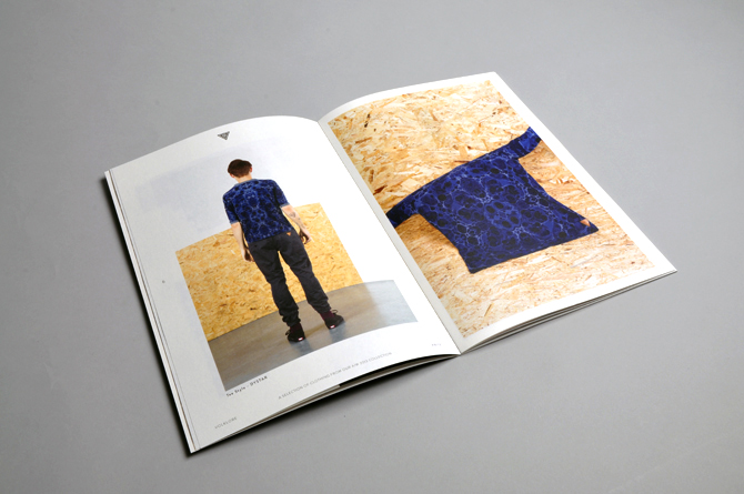
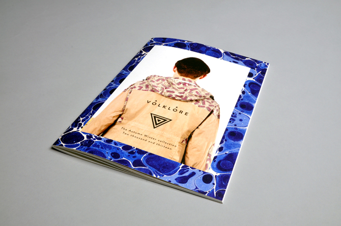
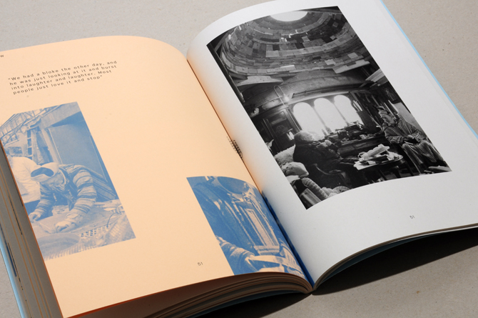
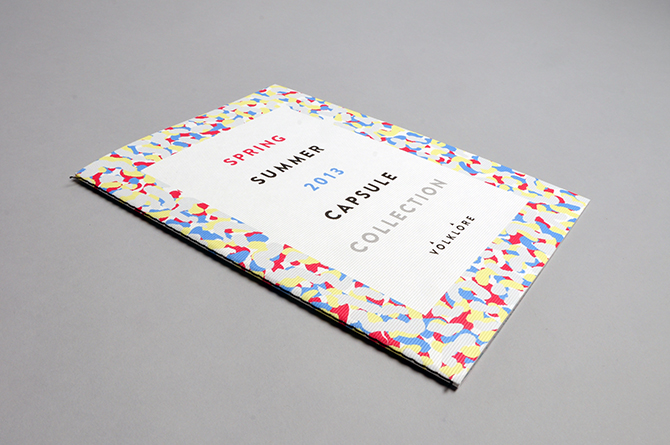
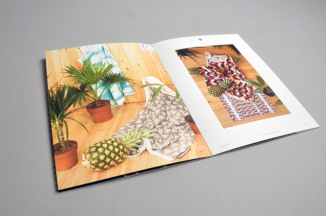
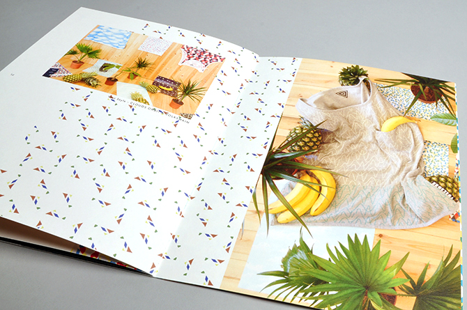
I art directed and designed their lookbooks for my degree project and used it as a statement of intent for both how I wanted to represent myself as a designer and the areas that I wanted to work in once I’d graduated. I created two very different concepts for two collections of clothes. The SS/13 capsule collection was all about summer and bright colours. The AW/13 was similarly playful but the concept was to replicate the brand’s unique style of pattern and panelling through both the photography and the design of the books.
What would be a dream commission?
To design my own colour scheme and graphics for a Ford GT40. I loved their boldness ever since owning a Scalextric version as a kid.
Describe your style in three words.
Eclectic, vibrant and dynamic.
jaspervandenbosch.co.uk

