
As part of our new Founding Members programme, Grafik is profiling a selection of studios that are not only producing exceptional work but are also helping to shape the wider landscape of contemporary visual culture. These are the practitioners with a clear point of view, a sense of authorship, and a commitment to the craft of communication. Stockholm-based studio SNASK fits this profile precisely. Their work resists easy categorisation. It is visual, expressive, narrative-driven and unmistakably theirs.
SNASK describes itself as a creative agency built on love, courage and real emotion. While that may sound lofty, the proof lies in the work. From large-scale campaigns and product design to books and music videos, their output has an internal consistency that is rare. There is a deliberate rejection of minimalism and corporate restraint in favour of something more human. Something that connects.

Formed by what they call "misfit geniuses," SNASK's approach is as much about attitude as aesthetics. Their studio operates on a set of values that prioritise honesty, empathy and visual clarity. The tone is irreverent but never cynical. They believe that design should make people feel something, and they build entire visual worlds around that principle. It is a position that informs every part of their process, from concept and direction to typography and production.
The studio's recent projects speak to this ethos. Here are five that exemplify how SNASK balances concept, craft and communication.
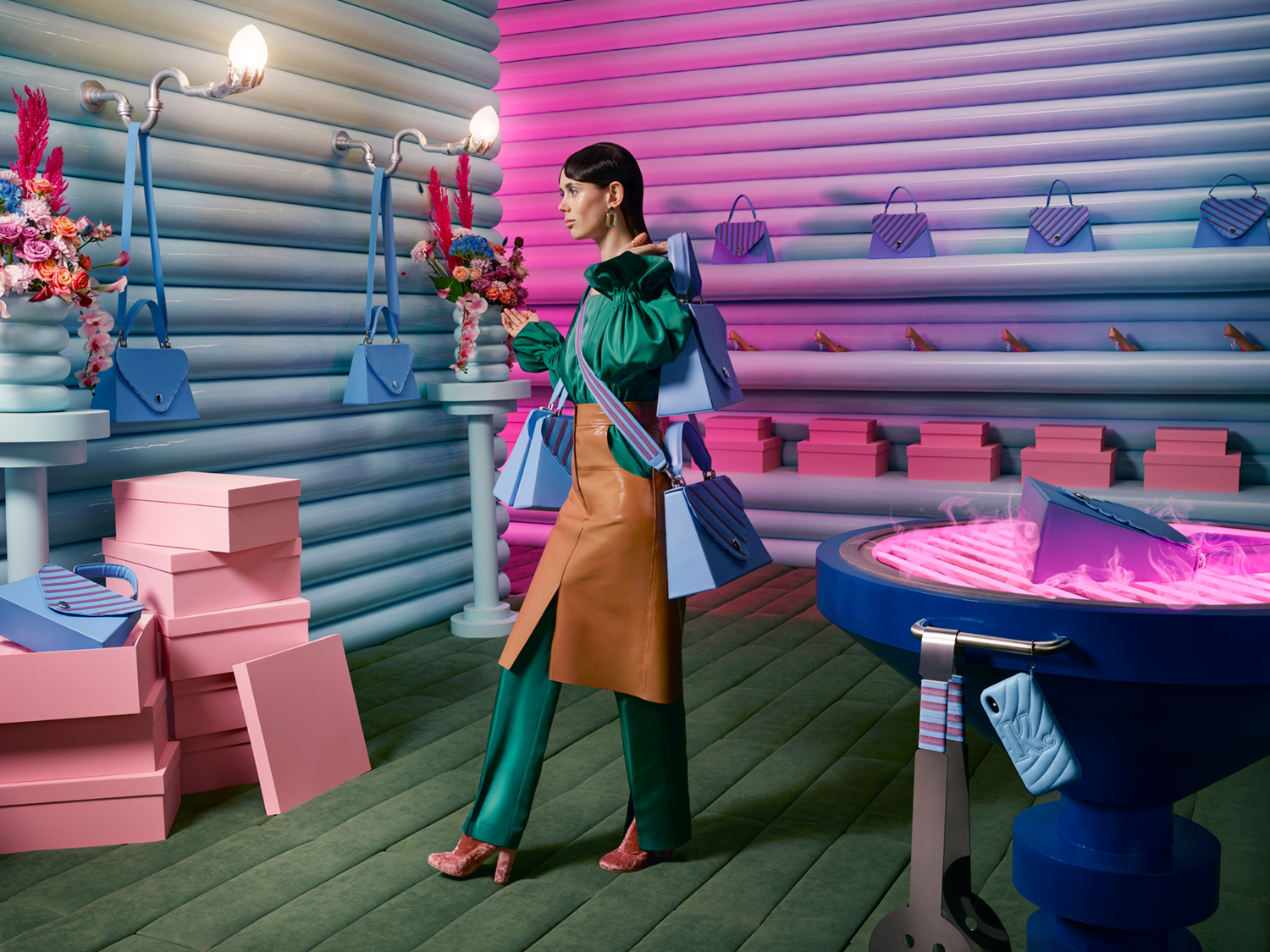
Klarna: Smoooth Situations
Klarna's Smoooth Situations campaign series marked a departure from the generic look and feel of fintech marketing. Working across multiple executions, SNASK built surreal, cinematic scenarios to express the idea of "smoothness" through a lens of humour and high production. From a horse orchestra to a handbag that doubles as a BBQ grill, the campaign draws attention through absurdity, yet remains strategically focused.
Each visual is meticulously staged. Colour palettes are bold but considered. Lighting and texture are pushed to near hyperreality. The result is a campaign that feels self-aware, generous and completely distinctive within its sector.

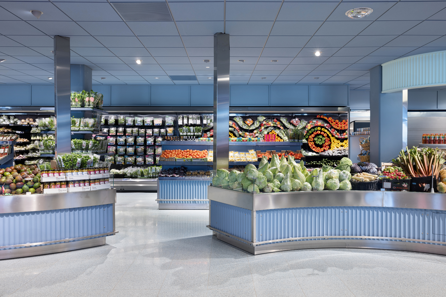
ICA Stop: A Supermarket Reimagined
When Swedish grocery store ICA Stop commissioned SNASK to lead a full rebrand and interior transformation, the brief was clear. Make it feel like a place worth visiting. Rather than rely on abstract strategies, SNASK approached the project through storytelling and tactility. Signage, tone of voice, in-store graphics and environmental design were all developed in parallel.
The visual identity borrows more from local culture than corporate retail. Typography has presence. Materials are warm and lived-in. The result is a brand that feels rooted in place, while reflecting the studio's belief that even everyday environments can benefit from considered design.
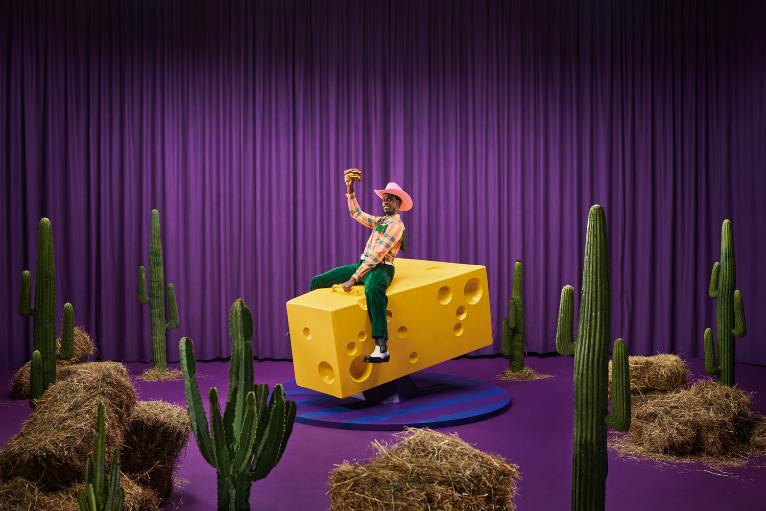
Oddlygood: Cheesington
For Oddlygood's vegan cheese range, SNASK created a fictional world called Cheesington and built a campaign around it. This character-led, world-building approach reflects the studio’s ability to move beyond conventional product storytelling. The campaign avoids tropes common in health-conscious food marketing and instead positions the brand as joyful and confident.
Visuals are colourful, stylised and theatrically staged. There is a strong sense of direction, but also a clear understanding of audience. Rather than educate, the campaign entertains. This approach allowed the product to stand out in both visual and strategic terms.
LOQI x SNASK: Artist Series
Collaborating with LOQI, SNASK produced a series of reusable bags that merge function with statement design. Treated as canvases, the bags feature fluorescent colours, typographic motifs and graphic layouts that carry the studio's visual language in full.
This collaboration is a good example of how SNASK applies its philosophy across formats. The bags are accessible, but not diluted. They carry the same conviction as their larger campaigns and demonstrate that product design can be both playful and rigorous.
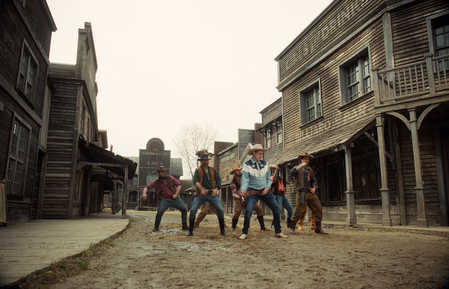
Viagra Boys: Punk Rock Loser
Directed by SNASK, the video for "Punk Rock Loser" by Viagra Boys is frenetic and confrontational. Shot with a gritty cinematic aesthetic, it captures the tension and chaos of the song while applying the studio’s signature sense of composition. The visuals oscillate between satire and sincerity, with a rhythm that mirrors the band's energy.
This project shows SNASK's strength in direction and art production. It is a reminder that their skill set extends beyond print and branding, and that their core values can be translated into motion with equal clarity.
Publishing and Posters
Alongside their commissioned work, SNASK produces their own publications. Their studio books, now in a third edition, serve as both documentation and declaration. Combining project insight with editorial writing, the books reveal much about how the team works and why they continue to resist the pull of commercial conformity.

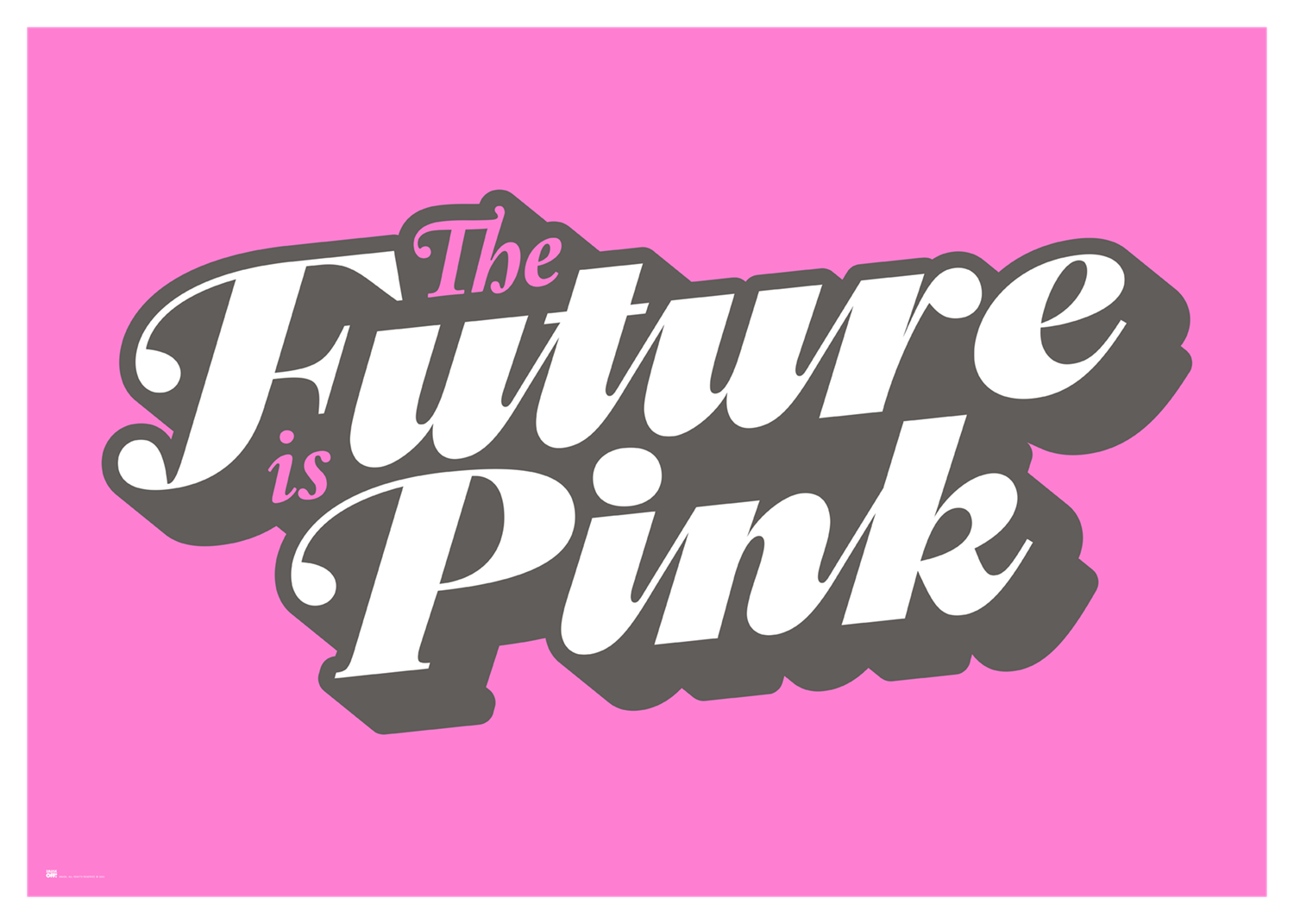
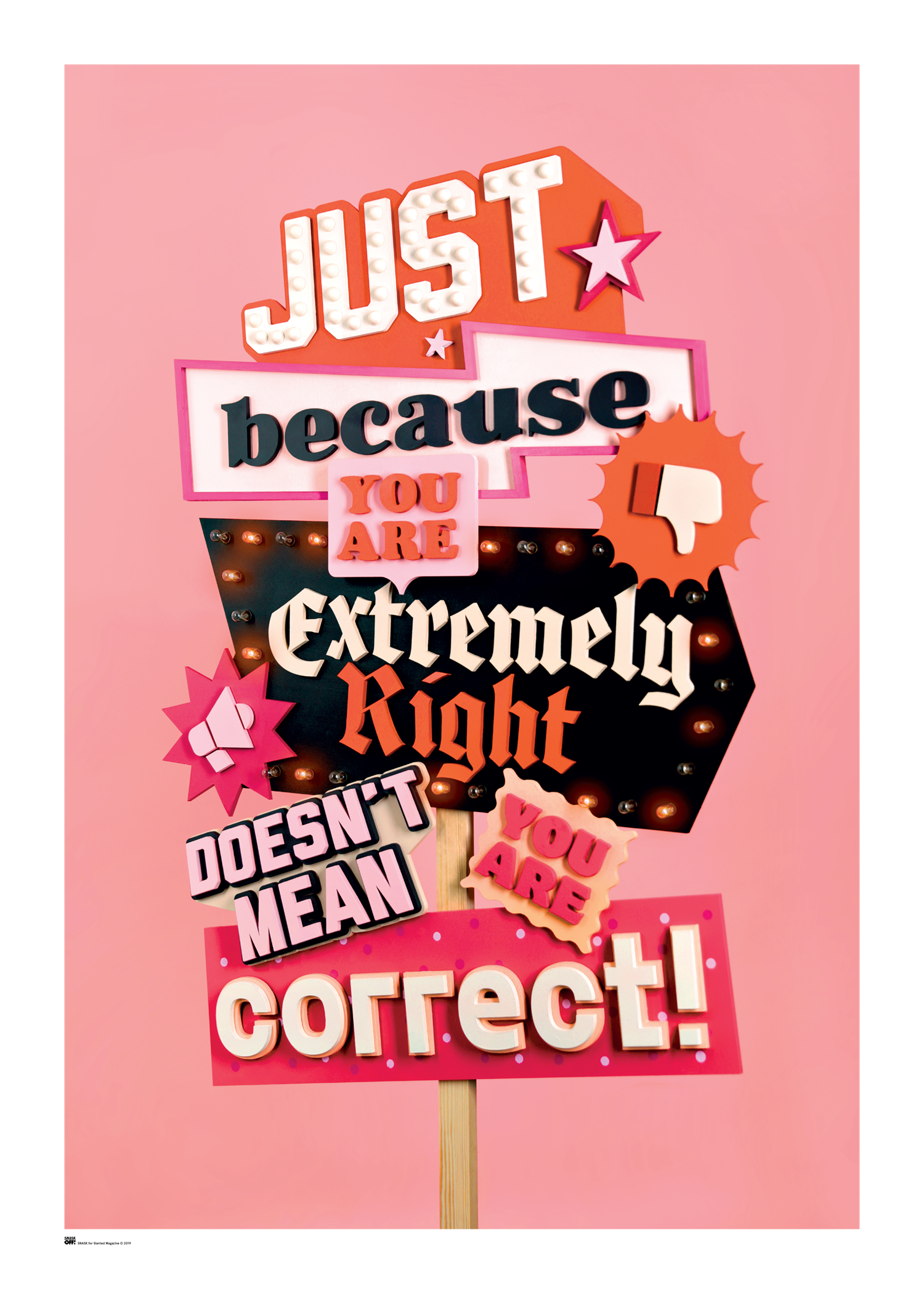
Their posters operate in a similar way. "The Future is Pink" and their contribution to Slanted’s series demonstrate a commitment to design as message, not just form. These pieces circulate widely, both online and in print, and are frequently used in lectures and exhibitions to illustrate the possibilities of expressive graphic language.
A Grafik Founding Member with Vision
SNASK’s inclusion as a Grafik Founding Member reflects our belief in studios that lead with intent. Their practice is a reminder that design need not retreat into silence or simplicity. Instead, it can speak loudly, act emotionally, and take responsibility for the impact it creates.
At a time when so much design feels over-filtered and underwhelming, SNASK continues to demonstrate that boldness and care are not opposites. Their work is theatrical but never hollow. It performs, but always on purpose. This is design with conviction, made by a team that understands the value of standing for something.