In a deviation from our usual Letterform format, unorthodox French studio My Name Is Wendy has broken the mould in writing a surreal short play based on the two sides of iconic type designer Paul Renner.
Dr. Corner & Mr. Round
Fiction in tribute to Futura and Paul Renner
Dr. Corner / Paul Renner: Doctor of Functionalism
Mr. Round / Paul Renner: Graphic designer, type designer, painter, teacher
Loren Ipsum: Typist, collaborator, friend
The summer of 1924
In a studio in Munich at 2pm
Dr. Corner, smoking his pipe: Please, turn that radio off, Loren.
He moved the papers on the table in front of him. He was concentrating intensely...
Each paper was a chess board, each chess piece was a word aligned to an inflexible straightness.
The first letters drawn were the sentence: Die Schrift unserer Zeit [See footnote 1]
Loren Ipsum, tired: I thought you liked the ballads [2]
... Dr Corner, for God’s sake, why are you under the table?
Dr. Corner, crouched down, angry: It’s not geometric. Plus this table has grotesk boots [3] ..uh...feet like hideous gothic fonts.
The ground is not flat, oh my golly. What is all this lyrical fuss?
I’ve folded a piece of paper under one of the table legs.
Ah yes, I thought this paper would work, perfect!
Let’s get back to the topic.
Down with calligraphy and lower case!
You know Loren, we should light a candle each year, in memory of the Phoenicians, hallelujah.
Long live corners and straights. Let’s go modernity!
That’s what they want.
Loren Ipsum: What on earth are you talking about?
Dr. Corner: This morning, Jakob Hegner came to the studio.
He wants me to design The typeface of your time [1].
Loren Ipsum, clapping her hands, excited:
What a compliment to your great work.
A tribute to our time, aaahhhh.
Sidney Bechet, the Dadaist movement, Art Deco, Miss Baker, The Charleston, Dr. Mabuse der Spieler...
Dr. Corner, stopping her:
You must be confused, Loren. Just functionalism. This is the essence, nay the epitome.
No fantasies and all these tacky knick-knacks.
This typeface must represent the industrial era, a timeless typeface and without a particular style.
In layout photomontage and asymmetrical constructions we need new typefaces.
He draws a square
We have to start with simple shapes. At first, the square. Let’s see, what do you think about that?
Loren Ipsum: Well, I will try to be a strictly Bauhausian woman, dear docteur.
But willy-nilly, passion or “love can transpose to form and dignity” [4] Anyway, uh...
Are you planning on making any sort of letter with a square?
You’re an absolutely hopeless formalist.
Think of it more as sort of allegory...
Dr. Corner: What? Where?
Loren Ipsum: Here, look. A square in a quarrel is a poor square in hell until the end of time.
Please, Take a square and caress it, maybe it will become vicious like a circle [5]
Oh, If he were only here...
Dr. Corner: Who ?
Loren Ipsum, afflicted: Mister Round, come on, we’re not doing this again.
This time Loren waited patiently until he chose to speak again. In a minute or two Dr. Corner took his pipe out of its mouth. [6]
Dr. Corner: One side will have guidelines.
He puffed smoke squares and triangles upward into the room. But the more he smoked, the more the shapes grew. After a while, there were only perfect smoke rings. Now, Dr. Corner was hidden behind a cloud of smoke.
Loren heard in her excited imagination: The other side will have curves!
Loren Ipsum: One side of what? The other side of what? [6]
I’m like Alice in front of the caterpillar. Well, there’s an identity crisis coming.
The smoke cleared. A other man was in front of her. Dr Corner was gone.
Loren Ipsum, relieved: Oh Mister Round, finally you are here.
Mr. Round, inspired and drawing two intricate shapes: Ahh the curves the curves, what better way, you’re right Loren. That aspect was missing, we need to form clear letters.
If so, even aliens will be able to read this typeface.
He observes his drawing.
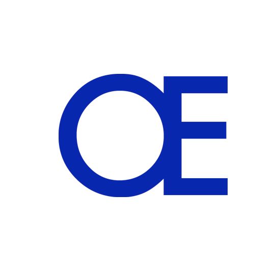
Œ
O is as formal as the Tulip table by Eero Saarinen
E is as structural and strong as an armchair by Le Corbusier, perfect!
Loren Ipsum: You’re an absolutely hopeless fanatic,
romantic, eclectic, eccentric, formalist!
Seriously, think of it more as sort of allegory...
Mr. Round: What? Where?
Loren Ipsum: Here, look. A ligature œthel.
Look closely at this letter. It’s you, here.
It’s your life’s work, your fight, your personal conflict,
your hopeless consciousness in historical fact.
Maybe, œthel symbolises your friendship with Jan [7]
or passion and Functionalism or the Myth of
Sisyphus. The letter o is a cornerstone, it’s...
Dr Corner.
Mr. Round: Who is it ?
___________________________________________
1. The typeface of your time Christopher Burke.
Paul Renner, the art of typography
2. In 1938, Paul Renner designed the Ballade typeface
3. Indexgrapfik.fr
4. W. Shakespeare. A Midsummer Night’s Dream
5. Eugene Ionesco. The Bald Primadonna
6. Inspired from Lewis Carroll. Alice’s adventures in wonderland
7. Jan Tschichold, typographer

