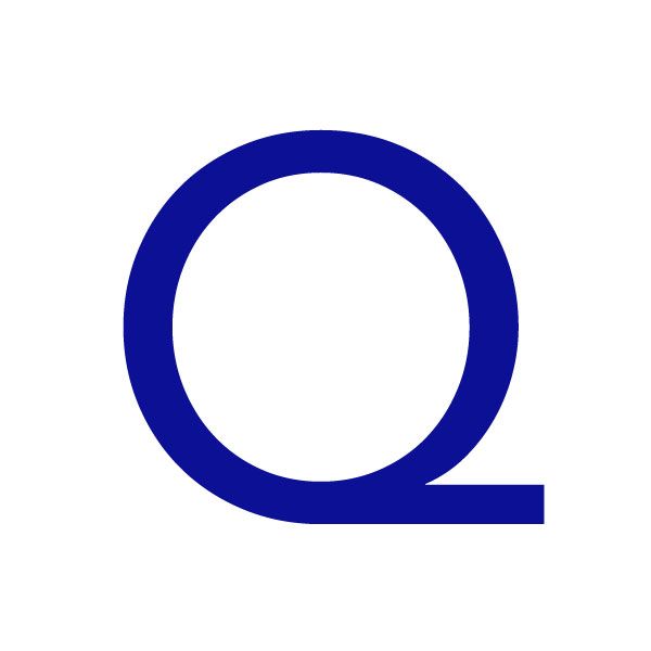
Full of imperfections and packed with personality, Avenir is its designer Adrian Frutiger's favourite typeface. Soapbox & Sons’ Jenny Theolin explains why she agrees with his assessment. I may be on a 1980s wave at the moment, but I absolutely adore the Avenir uppercase ‘Q’. As the font family name suggests, fast-forward twenty-six years into the future, and voila it still feels contemporary. In fact, Amsterdam recently used Avenir in its city branding. I am surprised the musical Avenue Q didn’t use it though — a typography joke that got away.
Outside the Soapbox & Sons studio, I have also been busy teaching graphic design, and being knee-deep in typefaces, using and teaching my students about them. It’s interesting to notice how a typeface like this, which literally means ‘future’ (in French), really has the longevity it was meant to have. It’s the quiet confidence, the elegance, the ‘no-need-to-boast’ qualities, which makes Avenir one of my favourites.
Designed by Adrian Frutiger and inspired by predecessors Futura, Univers and Kabel, this humanist linear grotesque typeface is really rather stunning. According to Frutiger himself, Avenir is “the most precise typeface [he] has ever drawn”. Bear in mind it was all drawn by hand too.
According to Monsieur Frutiger, Avenir was intended to “feel slightly more human” than its competitors, which I agree it still does. It is slightly less perfect than the others, and it’s this I am growing to love. And guess what, it is precise, but not perfect. If you look really close, you can see the 'O' is not a symmetrical circle – and neither is the 'Q'.
Frutiger has said it was because he created Avenir alone, in peace and quiet, without any assistants, that allowed his personality to shine through. And for a man who’s a Font God, the fact that Avenir is also his favourite says quite a lot. So, I am proud to be using it for my new business cards, which I will be designing alone on an island in the Stockholm archipelago.
Jenny Theolin
…is the creative director behind Soapbox & Sons, a design agency that specialises in brand experience and curation. Having worked with clients like AOL, HSBC, Schroders Investment, Turner Broadcasting, Microsoft and Unilever while in London, she has recently moved to Stockholm with the aim of bridging the gap between creative projects in both cities. Don’t miss her recent project Comic Sans For Cancer, which raises money for Cancer Research UK while celebrating the typeface’s twentieth birthday.
Adrian Frutiger
As well as Avenir, this well-respected type designer is responsible for expansions of Univers, as well as Serifa and Egyptienne typefaces. In the early 1970s he was commissioned by the public transport authority of Paris to rethink the city’s metro signage, tweaking Univers to make it easier to read in bad light. This led him to create a new alphabet for the Charles de Gaulle International Airport, and adaption of Gill Sans which he named Frutiger, which had to be legible both from long distances and from an angle. Now in his late eighties, Frutiger was awarded the European Design Award in 2009.
August 21, 2014 2 minutes read
Maestro’s Favourite
Full of imperfections and packed with personality, Avenir is its designer Adrian Frutiger's favourite typeface. Jenny Theolin explains why she agrees with his assessment.

