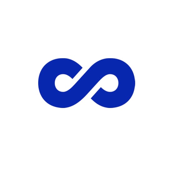
Prakt’s Matti Tuominen muses on the experience-specific nature of typography and selects the ∞ character from Thomas Thiemich's Remo Stencil as the perfect embodiment of his thought process. When designing type, I try to draw or choose forms that are perfect vessels for the message. At the same time, I become a part of the never-ending, meaning-making process. If I succeed, the reader can share in these mental landscapes I've chosen to use. Maybe the letterforms even grab and save a small piece of this process for future encounters with readers.
I've learned to love letterforms that I used to dislike, even hate. Actually, those can turn out to be my future favourites. As I see them used, sometimes in a surprising context, they start to change. Gradually, I get to know them better and the forms become filled with new meanings.
Forms – even letterforms – don't carry embedded universal secrets in them that we receive directly when our eyes scan their outlines. The old idea of a common visual language that overcomes cultural barriers is a comforting but unlikely one. We always see things in a certain context and receive the meanings filtered through our previous experiences. Ideas and concepts always guide our perception.
Typography is the immediate context of letterforms. It is a mixture of several familiar things: white space, texture, and other graphical elements; at a micro-level, point-sizes, spacing, kerning, etc. The forms might have a long history that guides the way we sense them, but the present can also override the past. They might as well have been designed for a certain, now unsung use.
Letterforms have a second life in the hands of the users that type designers can't control. Graphic designers give letterforms a context, the surrounding typography. Then our experiences, the mental images in our memory, our cultural influences, time, space and everything else you can imagine, shape how we see them. In the end, we tend to see what we want to see.
At this very moment, my favourite letterform – inspired by the process of writing this feature – is the ∞ character from Thomas Thiemich's Remo Stencil (2012). The meanings that letterform conveys are, however, anything but stable – and so is the position of my favourite letterform.
prakt.fi
Matti Tuominen
…founded Helsinki-based design studio Prakt in 2011. Often designing bespoke typefaces for projects, the studio draws inspiration from the clients themselves to influence the form. For example, its typeface for grassroots events organisation Bermuda Helsinki was triggered by signage on the harbour buildings local to the business and its recently work for the Mikkeli Illustration Triennial in Finland involved designing custom lettering formed from tools like pencils and rulers. Prakt is currently working on the identity for new Helsinki gallery Korttelitoimisto.
Infinity
Sometimes called the lemniscate, the sideways figure of eight was first used to mean infinity in 1655. It is thought that its usage stems from ω or omega, the last letter in the Greek alphabet. In Canada, the infinity symbol is used on the flag of the Métis people, an indigenous group that trace their heritage back to the First Nations and early European settlers.
January 8, 2015 2 minutes read
Infinity Loop
Prakt’s Matti Tuominen muses on the experience-specific nature of typography and selects the ∞ character from Thomas Thiemich's Remo Stencil as the perfect embodiment of his thought process.
